Friday, 25 February 2011

Tuesday, 15 February 2011
More Magazine Advert Research

 This content is adapted from the following [blog]. Like jake the black colours and sans text of this advert are not suitable for our audience because it is too gothic. The band and band name are the focal point of the image. There is a clearly defined box for the tour dayes and another tow boxes for digipacks with their covers shown and suitable information on where to find them prusuading the user to but them. In the tour dates the user can see the date and venue of each performance. This is titled in the smae font as the heading to signify its part of the same document. The part at the bottom is signified as seperate because of its change in colour. It advertises the companies HMV and PLAY.com as well as the releases they have.
 Its clear that the below digipak advert is a live digipak much like ours so therefore uses a  image of the band performing live. There is once again a clearly defined box saying the date of release and some pursuasive text on what the digipak includes. Next to it is an image of the digipak. Below in a seperate box is an advert for a seperate digipak and below this are the retail company logo's.
 image of the band performing live. There is once again a clearly defined box saying the date of release and some pursuasive text on what the digipak includes. Next to it is an image of the digipak. Below in a seperate box is an advert for a seperate digipak and below this are the retail company logo's.
 An important factor for consideration is using a powerfull image such as the one to the right made by a student [link]. This helps create polysemy and draws the audience in to the narrative enigma.


Thursday, 10 February 2011
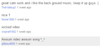
Audience Feedback Rough Cut 3
Context
Audience Feedback
How I will respond to the audience feedback
Audience Feedback
How I will respond to the audience feedback
- Remove some shots of the drummer
- Change the eviction notice so it says UK
- Remove the shot of the car going over the pot hole
- Remove the shots of the lighter
- Remove the first burning photo shot
- Change the colour distortion on the bricks so they dont look purple
- Add some shots of a key going through a leterbox
- Put the argument on screen for less amount of time
Tuesday, 8 February 2011
Magazine Advert Draft 2

Improvements I have Made
I have conventionally put the band in the image although still put them within th polysemic diagetic world choosing to put them on the pavement than in person so the perspective could still be seen. The image now singifies more torture from the screaming lead singer and the blood red skye. This helps appeal to a larger audience because it is more interesting. The images of the band also helps appeal more so to fans of the band and the femal gaze. The use of the blood red sky appeals to horror fans and fans of darker rock. While the urban landscape appeals to social realist fans and the urban environment is as typical to rap videos appeling to a new audience.
Audience Feedback

How I will respond to the audience Feedback
I will increase the resolution in Adobe Photoshop Elements.
Magazine Advert Draft 1

What I tried to achieve in the draft
I've tried to stick to the social realistic theme of thr digipack by using mainly diagetic information. The titles are in a sans font to both signify documentary style image and to show the bands brand typography to help signify the band. The use of the diagetic information is also an intertextual reference to competitions you'd find in a magazine and is to appeal to a younger audience becuase it signifies rural rebellion. The image itself is intentionally polysemic to create narrative enigma and draw the audience to by the album. However we see the greyed out effect wich signifies bleakness relfecting the sadness of the song confessions.
Feedback We Recieved

How I will respond to this feedback
I will remove the bubblegum Out now on iTunes and I will relate to the codes and conventions better.
Thursday, 3 February 2011
Audience Feedback Rough Cut 2
2

How I will Respond to this Feedback
- Change the pace of the footage to fit the music better
- Add more locations and characters
- Shorten some clips
- Use final cut rather than iMovie from now on
- Slow down the friends scene
Subscribe to:
Posts (Atom)