
Taking influences from the Kasabian digipak cover. I took the below image from a still frame on the video as we didn't have any images of the band themselves since the performance footage was taken at an earlier date. 


I then added the artistic effect of cutout to the image and used the paint bucked tool to fill the image in. I then added text in the We Are The Ocean times new roman font and added the hassle records logo.

To create the magazine advert as above I made the image larger to keep a common theme and used a smaller image to show the digipak 
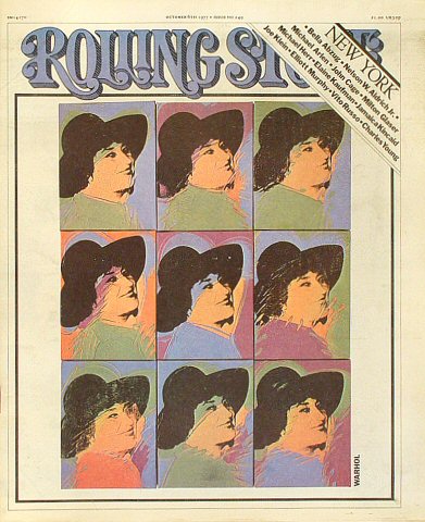
From getting audience feedback I was suggested to look into Andy Warhol [wiki] .
.
.


This helped me create these front and back covers I made it a pattern like the  Madina lake front cover. I added the CD and DVD symbols to the front as the audience couldn't recognise what I was in the previous rough cut so I added more anchorage.
 Madina lake front cover. I added the CD and DVD symbols to the front as the audience couldn't recognise what I was in the previous rough cut so I added more anchorage.
  I also added more anchorage to the Magazine Advert in text with "The Live Album" to show it wasn't just the tour I was selling. I added tour dates in a banner as it was easier to notice. I chose only one company logo as if Crossbeck Media had a spectial deal with HMV. I also replaced the white colour with black so it fit into the background.
No comments:
Post a Comment
Please make sure your comments are appropriate