Friday 25 February 2011

Rough Cut 5


The Audience Feedback

How I will Respond to this Feedback

I will cut out the flickering as much as possible
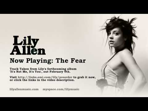
I will try to change the audio track
I would change the pacing of the video
I'll try not to repeat too many shots
I'll get rid of the shot of the coin

More Magazine Advert and Image Research


A key focus of the magazine adverts which I haven't yet focused on is the image. It has to:
  • Portray the band as a brand
  • Pursuade the user by being poloysemic creating narrative enigma and drawing the audience in
  • Be consistent with the rest of the advert in order to further the bands brand

Lily Allen - The Fear Mag Ad [blog]

Lily advertisement
Unlike the lesser know artists Lily Allens advert has less text on it with the key focus the image and the bold title Lily Allen. This image appeals to the male gaze. The use of black and white is polysemic to create narrative enigma and draw its audience in. It could signify honest documentary style footage or it could signify she is pretending to be a character in an old movie. I believe the preffered reading is to signify that she is both fun and mysterious and is an intertextual reference to artistic modeling. Her scruffy hair signified that she is a rebel while her white dress signifies she is innocent. While this reading is juxtaposed with the signifier that she is not innocent in her split open dress. 

Higher Learning Volume 2 Digipak  
This image is clearly used as a shock tactic. The Simpons has a target core audience of 8-16 with a secondary audience 16-35 as its been going so long.  Fashawn an underground hip hop rapper [wiki]would appeal to this secondery audience of the Simpsons. It being a childrens show using a black bart and juxtaposing the innocence of childhood with the harsh reality of gangstar life. It gives the musician the image of being rebelious, tough and unafraid.


 Juliette Lewis - Tera Incognita [blog]
In this magazine advert the protaganist is signified as a sense of disruption by the cross in the text and the birds flying round him. Here the text comes in  the form of a banner as if the advert is a poster. The red signifying warning or danger.


The band's digipak image
Looking at the earlier blog post on the band as a brand I will need to portray the band in a fun casual way at least.  


Magazine Advert Draft 3

I have tried to create a a magzine advert that is informative and advertises both the band and the digipak well.  

Digpak Final Draft

I think this both looks professional and signifies the band live very well.

Digipak Draft 8

While the front looks better here I will have to change the back image but apart from that this digipak appeals to the target audience.

Digipak Draft 6 + 7


With this digipak I was trying to make the it more relevant to other digipaks by WATO and make it more graphic. I also wanted to make the image more generic. I was going with the frankenstein idea "it's alive!".  
I scrapped the idea and made it more relevant to the band by including live images of them performing. I also included the wave symbol.
"Callum Moreman still not relevant. apart from the background image, but the whale doesnt even make sense. Just coz the name has ocean in it doesnt mean a whale can go on the front cover"

"the inner looks espec good; any reason to make the front so distinct from the other panels?"

I will therefore keep the inner and back as they are and remove the wave and whale from the front.

Audience Feedback Rough Cut 4

From an email from the teacher
"Maybe a slower paced intro? Slower transition on 'holding hands'? Maybe better to be more linear - stick inside house for a while; you jump back and forth. Maybe hold off on band footage til later (and make sure its all of the right band)


Black screen 0:48 in?

Shots of parents arguing not quite working; if at all, perhaps use as an overlay, or with another shot overlaid on these

about 2:45 in the eviction notice suddenly goes v bright. On screen too long - we don't want the detail about '5 years' - she's too young/risks confusing the aud

cuts out at 3:00; still with ropey audio track!

FX of burning photo now much more effective


main issue Chris is pacing; you need to think of the track as a whole and vary/fit your pace accordingly, as Carol Vernalis suggests the best vid directors do. Ironically, you've maybe gotten rid of too many shots from earlier cuts? Only 1 shot of the bridge now?! (maybe thats in missing section?) Also think about the issue of linear v non-linear"

How I will respond to this Audience Feedback?
  • Make the begining slower paced
  • Slow down the holding hands shot
  • Overlay the argument shot
  • Vary the pace better
  • Get some shots back from earlier rough cuts
  • Change the eviction notice

Rough Cut 4

Tuesday 15 February 2011

More Magazine Advert Research


After recieving this message I went back and researched more Magazine adverts below is my evidence.

This content is adapted from the following [blog]. Like jake the black colours and sans text of this advert are not suitable for our audience because it is too gothic. The band and band name are the focal point of the image. There is a clearly defined box for the tour dayes and another tow boxes for digipacks with their covers shown and suitable information on where to find them prusuading the user to but them. In the tour dates the user can see the date and venue of each performance. This is titled in the smae font as the heading to signify its part of the same document. The part at the bottom is signified as seperate because of its change in colour. It advertises the companies HMV and PLAY.com as well as the releases they have.   


Its clear that the below digipak advert is a live digipak much like ours so therefore uses a image of the band performing live. There is once again a clearly defined box saying the date of release and some pursuasive text on what the digipak includes. Next to it is an image of the digipak. Below in a seperate box is an advert for a seperate digipak and below this are the retail company logo's.


An important factor for consideration is using a powerfull image such as the one to the right made by a student [link]. This helps create polysemy and draws the audience in to the narrative enigma.

Thursday 10 February 2011

Audience Feedback Rough Cut 3

Context


Audience Feedback


How I will respond to the audience feedback

  • Remove some shots of the drummer
  • Change the eviction notice so it says UK
  • Remove the shot of the car going over the pot hole
  • Remove the shots of the lighter
  • Remove the first burning photo shot
  • Change the colour distortion on the bricks so they dont look purple
  • Add some shots of a key going through a leterbox
  • Put the argument on screen for less amount of time

Rough Cut 3

Tuesday 8 February 2011

Magazine Advert Draft 2

Improvements I have Made
I have conventionally put the band in the image although still put them within th polysemic diagetic world choosing to put them on the pavement than in person so the perspective could still be seen. The image now singifies more torture from the screaming lead singer and the blood red skye. This helps appeal to a larger audience because it is more interesting. The images of the band also helps appeal more so to fans of the band and the femal gaze. The use of the blood red sky appeals to horror fans and fans of darker rock. While the urban landscape appeals to social realist fans and the urban environment is as typical to rap videos appeling to a new audience. 

Audience Feedback  
How I will respond to the audience Feedback

I will increase the resolution in Adobe Photoshop Elements.

Magazine Advert Draft 1

What I tried to achieve in the draft
I've tried to stick to the social realistic theme of thr digipack by using mainly diagetic information. The titles are in a sans font to both signify documentary style image and to show the bands brand typography to help signify the band. The use of the diagetic information is also an intertextual reference to competitions you'd find in a magazine and is to appeal to a younger audience becuase it signifies rural rebellion. The image itself is intentionally polysemic to create narrative enigma and draw the audience to by the album. However we see the greyed out effect wich signifies bleakness relfecting the sadness of the song confessions.

Feedback We Recieved
How I will respond to this feedback
I will remove the bubblegum Out now on iTunes and I will relate to the codes and conventions better.

Use of Technology in Creating the Magazine Advert

Magazine Advert Adobe Photoshop Elements

Thursday 3 February 2011

Audience Feedback Rough Cut 2

2


How I will Respond to this Feedback
  • Change the pace of the footage to fit the music better
  • Add more locations and characters
  • Shorten some clips
  • Use final cut rather than iMovie from now on
  • Slow down the friends scene 

Rough Cut 2

Rough Cut 1 before filming day 2